


Table of Contents
- Kitchen Cabinet Color Trends 2026: What’s Replacing White and Gray
- Warm Neutrals and Earth Tones Dominating Modern Cabinetry
- Nature-Inspired Greens and Blues for a Lived-In, Coastal Feel
- Matte Finishes, Textures, and Hardware Pairings That Complete the Look
- Two-Tone Kitchen Cabinet Ideas for a Modern, European-Inspired Design
- How to Choose Kitchen Cabinet Colors That Last, Resale Value, Lighting, and Durability
- Modern Kitchen Cabinet Color Trends for Small Kitchens
- DIY Cabinet Painting vs. Professional Refinishing: Budget and Results Compared
- Conclusion: Bringing Your 2026 Cabinet Color Vision to Life
Last Updated: May 17, 2026
Modern kitchen cabinet color trends are shifting faster than most homeowners realize, and the change is more dramatic than a simple palette swap. This guide from Denver Cabinet Painting Colorado covers everything driving that shift: why warm neutrals are replacing cold grays, which nature-inspired greens are taking over design feeds, and how to choose a color that holds up for years, not just seasons. Below, we’ll show you exactly how to match trending colors to your kitchen’s specific light, countertops, and layout, plus the honest trade-offs between DIY painting and professional refinishing.
Here’s what most trend guides get wrong: they show you the colors without telling you which ones photograph beautifully but look muddy in a north-facing kitchen, or which finishes chip within two years of daily use. That’s the practical gap this article fills.
Kitchen Cabinet Color Trends 2026: What’s Replacing White and Gray
The Shift from White and Gray to Warmer, More Grounded Palettes
The all-white kitchen had a long run. For most of the 2010s, bright white cabinetry was the default answer for any remodel, and cool gray became its natural successor. Both palettes share the same underlying logic: neutrality above all else.
That logic is now being challenged. Homeowners are moving toward colors that feel grounded and lived-in rather than sterile and showroom-ready. The shift isn’t about rejecting neutrality entirely; it’s about choosing neutrals with warmth and depth rather than ones that read as clinical.
A few forces are driving this. Interior design culture has absorbed years of Scandinavian minimalism and is now pushing back with warmer, more tactile aesthetics. The pandemic-era emphasis on home comfort accelerated demand for kitchens that feel welcoming rather than pristine. And social media platforms have made it easier for homeowners to see how colors like dusty sage or espresso actually look in real homes, not just staged showrooms.
The result: cool grays are losing ground to warm taupes, off-whites with yellow or pink undertones, and deep, saturated tones like navy and burgundy. White isn’t disappearing, but it’s being replaced by softer, more complex off-white shades that interact differently with natural light.
According to Houzz’s annual kitchen trends report, colorful cabinetry has been gaining ground steadily, with homeowners increasingly prioritizing self-expression over resale-neutral choices. That trend is accelerating into 2026.
The core shift in cabinet color trends isn’t about any single color. It’s about choosing palettes that feel personal and grounded rather than safe and generic. Warm undertones are the throughline connecting every major trend this year.
Warm Neutrals and Earth Tones Dominating Modern Cabinetry
Off-White, Espresso, and Burgundy: The New Cabinet Classics
Warm neutrals are the backbone of the 2026 color movement in cabinetry. These aren’t the stark whites or cool beiges of previous years. The colors leading the trend have undertones that shift depending on the light: creamy, peachy, or faintly golden.
Off-white is the most versatile entry point. Shades like Farrow & Ball’s "Pointing" or Benjamin Moore’s "White Dove" sit in the warm-neutral zone without reading as yellow or cream. They pair naturally with quartz countertops in white or soft gray, and they reflect light without the harsh brightness of pure white. For homeowners who want a clean look but not a cold one, off-white is the safest bet.
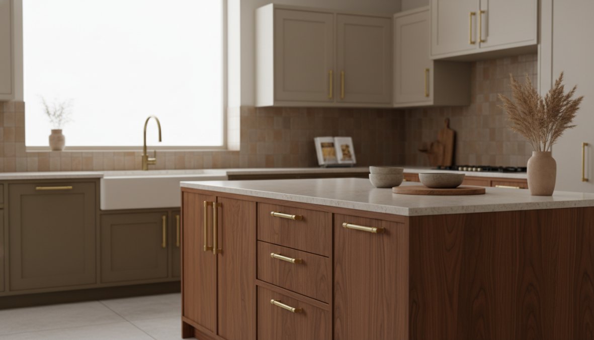
Espresso cabinets are making a strong return, particularly for base cabinets in two-tone designs. Dark wood-toned finishes add visual weight to a kitchen, grounding the space and making it feel substantial rather than airy. Espresso works especially well with chrome appliances and light-colored perimeter cabinets, creating contrast without the drama of matte black.
Burgundy is the boldest entry in the warm neutral category, and it’s gaining traction faster than most designers predicted. It functions as a deep, saturated accent color for island cabinetry or lower cabinets, adding richness to kitchens that would otherwise feel flat. Paired with brushed brass hardware and a marble-look quartz countertop, burgundy reads as sophisticated rather than dated.
The practical advantage of earth tones is durability of appeal. These colors have historical precedent in interior design, which means they’re less likely to feel aggressively dated in five years compared to more fashion-forward choices.
:::pro tip
When choosing between off-white shades, test paint samples in your kitchen at three different times of day: morning, midday, and evening with artificial light. The undertones shift dramatically, and what looks creamy at noon can look yellow under incandescent light at night.
:::
Nature-Inspired Greens and Blues for a Lived-In, Coastal Feel
Dusty Sage, Smoky Jade, and Navy Tones in Modern Traditional Kitchens
Nature-inspired cabinet colors are the most talked-about trend in kitchen design for 2026, and the enthusiasm is justified. Greens and blues bring a quality that white and gray simply cannot: they make a kitchen feel like it belongs to someone.
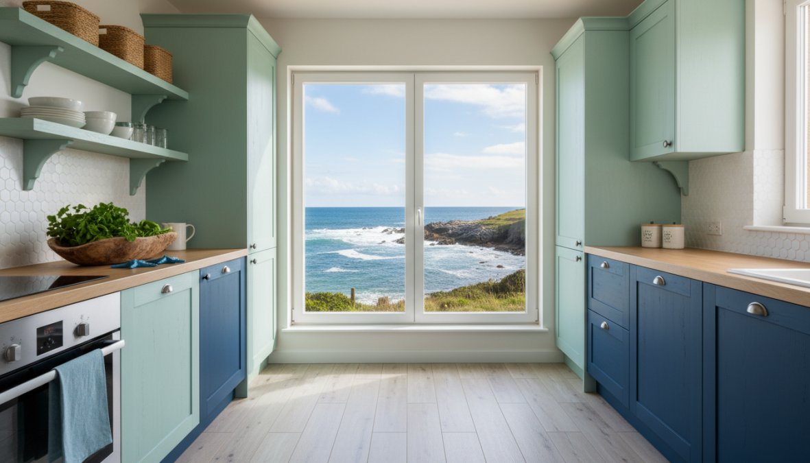
Dusty sage is the dominant green of the moment. It sits in the muted, gray-green zone rather than the bright or yellow-green range, which makes it far more versatile. Dusty sage reads as sophisticated in a modern traditional kitchen and coastal in a lighter, more casual space. It pairs naturally with natural wood elements, white perimeter cabinets, and matte black hardware.
Smoky jade is the deeper, more dramatic cousin of sage. Where sage is soft and approachable, smoky jade has enough blue in its undertones to feel rich and intentional. It works particularly well in kitchens with strong natural light, where the color can breathe without feeling heavy.
Navy tones occupy a different register entirely. Navy cabinetry, especially on base cabinets or kitchen islands, delivers a formal quality that works in both traditional and contemporary spaces. The key is pairing: navy with brushed brass hardware reads as warm and European-inspired, while navy with chrome appliances and white countertops reads as clean and coastal.
What all three of these colors share is the lived-in quality that defines the 2026 design aesthetic. They don’t try to disappear into the background. They contribute to the room’s character, which is exactly what homeowners are asking for.
As noted in Architectural Digest’s design trend coverage, green cabinetry in particular has moved from an accent choice to a primary cabinet color across a range of kitchen styles.
Matte Finishes, Textures, and Hardware Pairings That Complete the Look
Brushed Brass and Matte Black Hardware: Which Finish Pairs with What
The right hardware can make a good cabinet color great. The wrong hardware can undermine an otherwise well-executed design. This is where most homeowners make their biggest mistake: choosing hardware as an afterthought rather than as a core design element.

Matte finishes have largely replaced high-gloss cabinetry in trend-forward kitchens. A matte or eggshell finish absorbs light rather than reflecting it, which gives cabinets a softer, more tactile appearance. It also hides minor surface imperfections better than gloss, which is a practical advantage in a high-traffic kitchen environment.
The two hardware finishes dominating 2026 are brushed brass and matte black.
Brushed brass pairs best with warm colors: off-white, espresso, burgundy, dusty sage, and navy with warm undertones. The gold tones in brushed brass amplify the warmth in the cabinet color without adding visual noise. It works particularly well in modern traditional and European-inspired kitchens where the goal is elegance over edge.
Matte black hardware is the more versatile option across the full color spectrum. It pairs cleanly with sage, smoky jade, navy, and even off-white when the design aesthetic leans contemporary. Matte black adds contrast without competing with the cabinet color, and it holds up visually in kitchens where the cabinetry is doing most of the heavy lifting.
A useful rule: if your cabinet color has warm undertones, lean toward brushed brass. If your color is cooler or more saturated, matte black is the safer and often more striking choice.
| Cabinet Color | Best Hardware Pairing | Design Aesthetic |
|---|---|---|
| Off-white | Brushed brass or chrome | Modern traditional |
| Espresso | Brushed brass | European-inspired |
| Burgundy | Brushed brass | Warm contemporary |
| Dusty sage | Matte black | Coastal, modern |
| Smoky jade | Matte black | Bold contemporary |
| Navy | Brushed brass or matte black | Coastal or traditional |
Two-Tone Kitchen Cabinet Ideas for a Modern, European-Inspired Design
Two-tone kitchen cabinet ideas are one of the most effective ways to add visual depth without committing to a single bold color throughout the entire kitchen. The approach is simple: use one color for the base cabinets and a different, usually lighter color for the upper cabinets or perimeter cabinets.
The most successful two-tone combinations follow a consistent logic. The lower cabinets carry the darker or more saturated color, which grounds the space visually. The upper cabinets carry the lighter shade, which keeps the kitchen from feeling heavy or closed-in. This mirrors how color works in nature, with darker tones at the base and lighter tones above.
Popular two-tone pairings for 2026:
- Espresso base cabinets with off-white uppers
- Navy base with white perimeter cabinets
- Dusty sage lowers with natural wood uppers
- Burgundy island with white or cream surrounding cabinetry
The European-inspired approach takes two-tone further by mixing materials as well as colors, pairing painted cabinetry with open shelving in a contrasting wood tone. This creates a layered, customized look that feels intentional rather than assembled from a catalog.
One thing to avoid: choosing two colors that are too similar. If the contrast isn’t clear enough, the design reads as a mistake rather than a deliberate choice. The difference between the two tones should be visible from across the room.
Avoid using the same finish on both cabinet tiers in a two-tone design. If both colors are matte, the design can look flat. Introduce subtle variation, such as a slightly higher sheen on the upper cabinets, to add dimension.
How to Choose Kitchen Cabinet Colors That Last: Resale Value, Lighting, and Durability
Most trend articles stop at inspiration. This section goes further by addressing the three practical questions that actually determine whether a cabinet color choice holds up over time: what it does to your home’s resale value, how it behaves under your kitchen’s specific lighting, and how different finishes wear under daily use. None of these topics are covered with real depth by the current top-ranking results, which means this is where you can make a genuinely informed decision rather than a fashionable one.
Resale Value Analysis: Which Cabinet Colors Buyers Actually Want
The relationship between cabinet color and resale value is more nuanced than most staging advice suggests. The conventional wisdom, stick to white or neutral for maximum appeal, is becoming outdated as buyer preferences shift, but that doesn’t mean all trend colors carry equal risk.
The most useful framework is to think about cabinet color in terms of re-paint friction: how much effort and cost would a future buyer need to spend to change the color if they don’t love it? Colors that require multiple coats to cover, or that bleed through standard primers, create higher friction and can become a negotiating point in a sale.
Lower-risk colors for resale:
- Warm off-whites and soft creams: These remain broadly appealing and are easy to repaint over if needed. They read as move-in ready to the widest range of buyers.
- Dusty sage and muted greens: These have crossed from niche to mainstream, and because they sit in a muted, gray-leaning register, they read as sophisticated rather than polarizing to most buyers.
- Warm greige and taupe: These occupy the same broadly neutral space as gray did in the 2010s, but with warmer undertones that feel more current.
Higher-risk colors for resale:
- Deep burgundy or wine on all cabinets: Beautiful in execution, but highly saturated warm reds are among the hardest colors to cover cleanly, which increases re-paint friction significantly.
- Matte black on full kitchen cabinetry: Striking in design-forward homes, but it narrows the buyer pool and requires significant effort to change.
- Highly specific accent colors (terracotta, mustard, cobalt): These signal strong personal taste, which can be a selling point in the right market and a liability in others.
According to National Association of Realtors home staging research, kitchen updates consistently rank among the highest-return improvements before a sale, with cabinet refinishing offering strong value relative to full replacement cost. The key qualifier is execution: a well-applied, cohesive color scheme in a trend-forward but broadly appealing color outperforms a poorly executed neutral. Color choice matters less than finish quality when a buyer is standing in the room.
The practical recommendation: If resale is a primary concern within the next two to three years, choose warm neutrals or muted greens and invest in professional-quality application. If you’re planning to stay for five or more years, the resale calculus shifts, a color you genuinely love, applied well, is a better long-term decision than a safe color you’ll grow to resent.
Resale risk from cabinet color is mostly about re-paint friction, not aesthetics. Muted, gray-leaning colors carry the lowest friction. Deep saturated tones on all cabinets carry the highest. The finish quality matters more to buyers standing in the room than the specific color choice.
Lighting-Specific Recommendations: Matching Colors to Your Kitchen’s Natural and Artificial Light
Lighting is the single most underestimated variable in cabinet color selection. The same paint chip can look like three different colors depending on the direction your kitchen faces, the time of day, and the color temperature of your artificial lighting. This is the gap most trend guides completely ignore.
Natural light by orientation:
North-facing kitchens receive cool, indirect light throughout the day. This light has a blue-gray quality that pulls cool undertones forward in any color. In a north-facing kitchen:
- Cool colors like pure navy, smoky jade, and blue-gray can feel heavy or flat, they lose the vibrancy they show in showroom photography
- Warm neutrals, off-whites with yellow or peach undertones, and warm sage greens perform significantly better because they counterbalance the cool ambient light
- If you want a green, lean toward yellow-greens rather than blue-greens in north-facing spaces
South-facing kitchens receive warm, direct light for most of the day. This light amplifies warm undertones and can make already-warm colors feel intense by midday:
- Dusty sage, soft blue-gray, and cool off-whites work well because the warm light brings them to life without overwhelming them
- Warm colors like espresso and off-white with strong yellow undertones can look richer and more saturated than expected, test samples at peak sun hours
- South-facing kitchens have the most flexibility of any orientation
East-facing kitchens get warm morning light and cool afternoon light, which means the same cabinet color will look noticeably different at 8 a.m. versus 4 p.m. Warm neutrals and muted greens handle this shift better than highly saturated colors, which can look inconsistent across the day.
West-facing kitchens reverse the pattern: cool mornings, warm evenings. If you cook primarily in the evening, test your color samples under both natural afternoon light and your kitchen’s artificial lighting before committing.
Artificial lighting and Kelvin temperature:
This is the detail almost no cabinet color guide addresses. The color temperature of your light bulbs, measured in Kelvin (K), has a direct effect on how cabinet colors read after dark, which is when many homeowners spend the most time in their kitchens.
- Warm white bulbs (2700K-3000K): These are the most common in residential kitchens. They add a yellow-amber cast that warms up cool colors and intensifies warm ones. Under 2700K light, a cool gray cabinet can look beige, and a warm off-white can look distinctly yellow. Dusty sage reads as warmer and more golden.
- Neutral white bulbs (3500K-4000K): These render colors closer to how they look in natural daylight. They’re a more reliable choice if you want your cabinet color to look consistent between day and evening. Most professional designers specify 3000K-3500K for kitchen task lighting.
- Cool white or daylight bulbs (5000K-6500K): These add a blue-white cast that makes warm colors look flatter and cool colors look crisper. Rarely recommended for kitchen cabinetry unless the design intent is specifically clinical or commercial.
The practical test: Before finalizing a cabinet color, paint a large sample (at least 12 inches by 12 inches) on an actual cabinet door or a piece of primed board. Observe it at three points: morning natural light, midday, and evening under your kitchen’s current artificial lighting. If the color looks acceptable at all three points, it will work. If it looks wrong at any one point, it will bother you regularly.
:::pro tip
If you’re updating your kitchen lighting at the same time as your cabinets, choose your cabinet color first under your current lighting, then select bulbs in the 3000K-3500K range. This gives you the most accurate color rendering without the yellow cast of very warm bulbs or the harshness of cool daylight bulbs.
:::
Color Maintenance and Durability: What Paint Finishes Hold Up Best
The finish you choose determines how your cabinet color looks in two years, not just on day one. This is where the gap between an aesthetically correct choice and a practically correct choice becomes most visible.
Matte and flat finishes are on-trend but carry real maintenance trade-offs. Matte surfaces absorb light rather than reflecting it, which gives cabinets a soft, tactile appearance that photographs beautifully. The practical downside: matte finishes show grease, fingerprints, and cooking residue more readily than higher-sheen finishes, and they can be difficult to clean without dulling or burnishing the surface over time. For households with children, heavy cooking, or high cabinet traffic, matte is a high-maintenance choice.
Eggshell and satin finishes offer the best balance for most kitchens. They have enough sheen to wipe clean easily without the plastic appearance of semi-gloss. Satin is particularly well-suited to darker colors like navy and espresso, where the slight sheen adds depth without looking reflective.
How specific colors show wear differently:
- Matte white and off-white: Shows yellowing near the stove and cooking areas over time, particularly with oil-based cooking. Grease residue is visible on matte white surfaces within months of regular use. A satin or eggshell finish on white cabinets is a significantly more practical choice than matte.
- Matte black: Counterintuitively, matte black shows dust, dried water splashes, and light-colored residue (flour, powdered sugar) very clearly. It requires frequent wiping to maintain its appearance. The visual drama is real; so is the upkeep.
- Dusty sage and muted greens: These mid-tone colors are the most forgiving in terms of showing everyday wear. Minor smudges and fingerprints are less visible against a muted mid-tone than against either a very light or very dark surface.
- Navy and deep blues: Similar to matte black in that light-colored residue shows clearly. A satin finish on navy cabinets is strongly recommended over matte for practical durability.
Paint product durability by type:
- Waterborne alkyd paints (Benjamin Moore Advance is the most widely referenced): These cure to a hard, smooth finish that resists scuffs and cleans easily. They self-level well, minimizing brush marks. Full hardness is reached after approximately 30 days of cure time, cabinets should be handled gently in the first two to four weeks.
- Urethane-modified enamels (Sherwin-Williams Emerald Urethane Trim Enamel): These provide a varnish-like hardness that outperforms standard latex in scratch and scuff resistance. The trade-off is a higher price point and less forgiving application, runs and brush marks are harder to correct.
- Specialized cabinet coatings (Insl-X Cabinet Coat): Formulated for adhesion to existing cabinet surfaces including polyurethane and varnish, making them practical for refinishing projects where full stripping isn’t feasible.
The consistent finding across professional cabinet painters is that preparation accounts for the majority of a finish’s longevity. A premium paint applied over inadequately cleaned or poorly primed surfaces will fail faster than a mid-grade paint applied over a properly prepared substrate. This is the core reason professional results outlast DIY results, not the paint itself, but the preparation process behind it.
Modern Kitchen Cabinet Color Trends for Small Kitchens
Monochromatic Kitchen Looks and Colors That Open Up a Small Space
Small kitchens require a different approach to color. The goal isn’t to pick the most exciting trend color; it’s to choose a color strategy that makes the space feel larger and more cohesive.
Monochromatic kitchen looks are particularly effective in small spaces. A monochromatic design uses a single color across cabinets, walls, and sometimes even the backsplash, with variation introduced through texture and finish rather than contrasting hues. The result is a visually unified space where the eye doesn’t stop at boundaries between surfaces, which makes the room feel larger than it is.
For small kitchens, the best monochromatic base colors are:
- Soft off-white or warm cream: maximizes light reflection and feels open
- Light dusty sage: adds character without adding visual weight
- Pale blue-gray: coastal colors that read as airy and spacious
Darker colors aren’t automatically off-limits in small kitchens, but they require careful handling. A deep navy or espresso on lower cabinets only, paired with light uppers and a light backsplash, can work well. The key is keeping the upper half of the kitchen light.
Two colors that consistently struggle in small kitchens are highly saturated greens and warm burgundy on all cabinet surfaces. Both are beautiful in larger spaces but can feel oppressive when they surround you on all sides in a compact room.
Kitchen cabinet color trends for small kitchens also favor lighter hardware finishes. Brushed brass or polished nickel reflects more light than matte black, which can help in a space where every bit of brightness counts.
For small kitchens, the most effective color strategy is a light monochromatic palette with variation in texture and hardware rather than contrasting colors. This creates visual cohesion that makes the space feel intentionally designed rather than cramped.
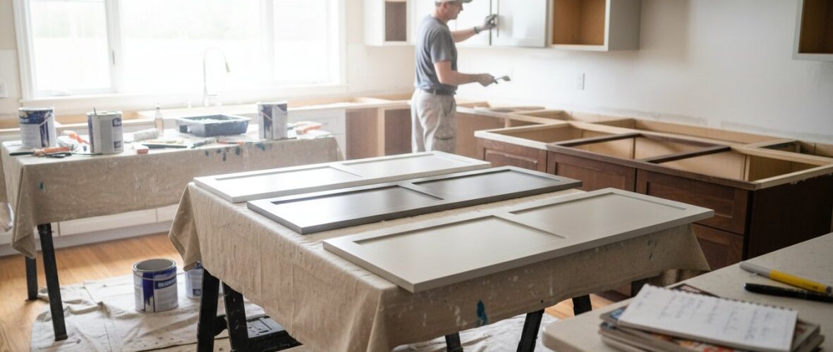
DIY Cabinet Painting vs. Professional Refinishing: Budget and Results Compared
This is the section most trend articles skip entirely, and the one that matters most when you move from inspiration to action. The decision between DIY cabinet painting and professional refinishing isn’t simply about budget, it’s about understanding what each path actually delivers, what it costs in time and materials, and where the results genuinely diverge. Here is an honest breakdown of both options.
What DIY Cabinet Painting Actually Involves
DIY cabinet painting is genuinely achievable for a careful homeowner, but the process is more involved than most project guides suggest. The finish quality you get is directly proportional to the preparation work you put in before a single drop of paint is applied.
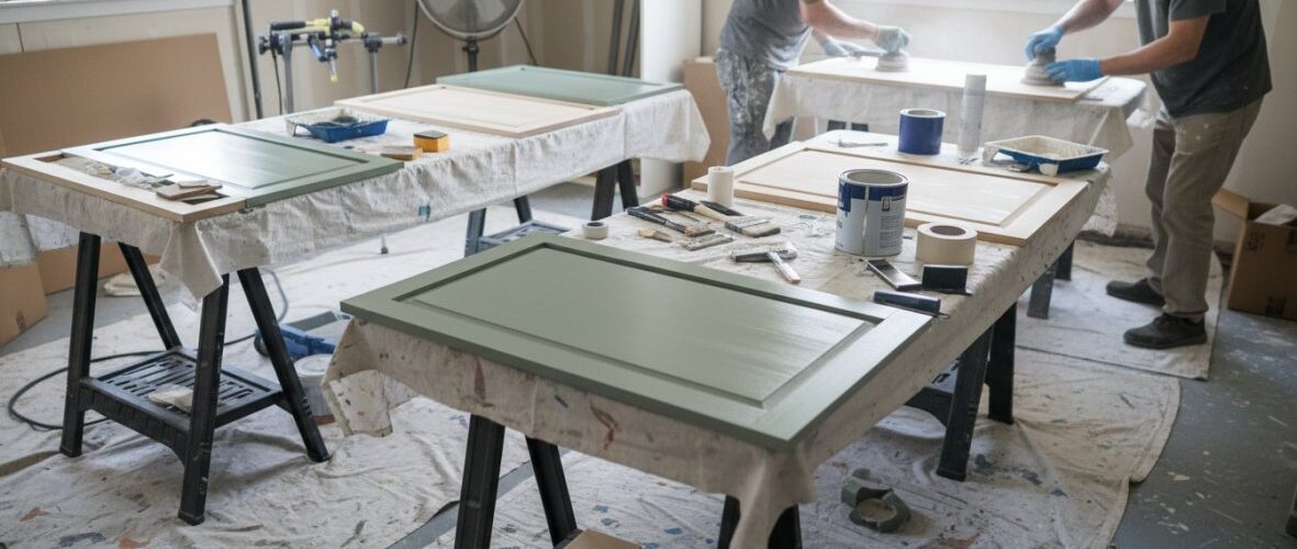
The full DIY process, step by step:
- Remove all doors, drawers, and hardware. Label everything so reassembly is straightforward. This step alone takes two to four hours for an average kitchen.
- Degrease all surfaces thoroughly. Kitchen cabinets accumulate cooking grease in the wood grain and on all surfaces, including areas that don’t look visibly dirty. A dedicated degreaser (TSP substitute or a product like Krud Kutter) is necessary, dish soap is not sufficient. Skipping this step is the most common reason DIY cabinet paint fails within the first year.
- Sand all surfaces. Light scuff-sanding (120-150 grit) is required to give the primer mechanical adhesion. On previously painted cabinets, this means sanding the existing finish, not stripping it entirely. On raw wood or previously varnished cabinets, more aggressive sanding or chemical stripping may be needed.
- Apply a bonding primer. A shellac-based primer (Zinsser BIN) or a high-adhesion water-based primer is necessary on slick or previously finished surfaces. Skipping primer or using a standard wall primer is a common DIY mistake that leads to peeling.
- Apply paint in thin coats. Two to three thin coats outperform one thick coat every time. Allow full dry time between coats as specified by the manufacturer.
- Allow full cure time before reinstalling. Most cabinet-specific enamels reach full hardness after 21-30 days. Reinstalling doors too early and then closing them can cause the paint to stick and peel at contact points.
Realistic time investment for a DIY kitchen cabinet project:
- Preparation (cleaning, sanding, priming): 12-20 hours for an average kitchen
- Painting (two to three coats, with dry time): 8-15 hours spread over several days
- Reassembly and touch-up: 3-5 hours
- Total: 25-40 hours of active work, spread over one to two weeks minimum
Realistic DIY material costs for an average kitchen:
| Item | Approximate Cost Range |
|---|---|
| Degreaser and cleaning supplies | $15-$30 |
| Sandpaper, sanding blocks, sponges | $20-$40 |
| Bonding primer (1-2 gallons) | $40-$80 |
| Cabinet-specific enamel paint (2-3 gallons) | $80-$180 |
| Brushes, rollers, foam rollers | $30-$60 |
| Drop cloths, painter’s tape, plastic sheeting | $20-$40 |
| Total materials | $200-$430 |
These are material costs only and do not include the value of your time. For a homeowner comfortable with painting and willing to invest the preparation work, DIY is a legitimate path to a clean result, particularly for flat-panel or Shaker-style doors, which are more forgiving than raised-panel profiles.
Where DIY results consistently fall short:
- Raised-panel doors with detailed profiles are difficult to coat evenly by brush or roller without visible brush marks in the recesses
- Achieving a factory-smooth finish without spray equipment is very difficult; most DIY results show some texture under raking light
- Consistent color uniformity across all cabinet surfaces is harder to achieve without professional spray application
What Professional Cabinet Refinishing Delivers
Professional cabinet refinishing addresses the limitations of DIY through three core differences: spray application equipment, systematic preparation processes, and controlled curing environments.
Spray application is the primary reason professional results look different from DIY results. Airless or HVLP spray systems apply paint in an atomized mist that self-levels into a smooth, even film. The result is a finish that closely resembles factory-applied cabinetry, something that is extremely difficult to replicate with brushes and rollers regardless of skill level.
Systematic preparation is where professional services earn their cost premium. A professional refinishing process includes thorough degreasing, sanding or scuff preparation, application of appropriate primers for the specific substrate, and often a finish sanding between coats. The preparation phase typically takes longer than the painting phase, which is the inverse of how most DIYers approach the project.
Controlled curing means that professional finishers understand the temperature, humidity, and ventilation conditions required for the specific products they use, and they manage those conditions rather than working around them.
Realistic professional cost ranges:
Professional cabinet refinishing costs vary significantly by region, kitchen size, door style, and the number of coats and colors involved. Rather than providing specific dollar figures that vary widely by market, the most useful framework is to compare the cost against the two alternatives:
- Cabinet refinishing (painting existing cabinets in place or with doors removed): Generally the most cost-effective professional option for updating color while keeping existing cabinet boxes
- Cabinet refacing (replacing door and drawer fronts while keeping existing boxes): More expensive than refinishing, appropriate when door style is changing significantly
- Full cabinet replacement: The most expensive option, appropriate when cabinet boxes are damaged, layout is changing, or a complete renovation is underway
For most homeowners whose cabinets are structurally sound and whose primary goal is a color update, professional refinishing delivers results closest to new cabinetry at a fraction of replacement cost.
The honest cost-benefit answer: DIY is the right choice when your budget is tight, your cabinets have flat or Shaker-style doors, and you have the time and patience to do thorough preparation. Professional refinishing is the right choice when you want spray-smooth results, when your doors have complex profiles, or when the kitchen is large enough that the time investment of DIY becomes impractical.
Durability Comparison: How Long Does Each Option Last?
The longevity gap between DIY and professional refinishing is real, but it is driven almost entirely by preparation quality rather than paint product quality.
| Factor | DIY (Well-Executed) | Professional Refinishing |
|---|---|---|
| Surface smoothness | Good on flat panels; variable on profiles | Consistently smooth across all door styles |
| Preparation depth | Variable; dependent on homeowner diligence | Systematic; consistent across all surfaces |
| Finish durability | Typically 3-6 years with proper prep | Typically 7-12 years with professional prep |
| Touch-up ease | Easy to match with leftover paint | Requires professional color matching |
| Time investment (homeowner) | High (25-40 hours active work) | Low (primarily access and scheduling) |
| Best application | Small projects, tight budgets, flat-panel doors | Full kitchen transformations, complex door profiles |
The most important variable in this table is preparation depth. A DIY project with genuinely thorough preparation, full degreasing, proper priming, adequate dry time between coats, will outlast a professionally applied finish over inadequate preparation. The preparation is where the investment of time pays off most directly, regardless of which path you choose.
As covered in This Old House’s guide to cabinet refinishing, proper surface preparation accounts for the majority of a cabinet finish’s longevity, which is why the preparation phase should never be shortened to save time.
The bottom line for 2026: Cabinet color trends are moving toward colors that require more intentional application than the forgiving whites and grays of previous years. A dusty sage or navy cabinet in a matte finish shows application quality more clearly than a white cabinet in semi-gloss. If you’re investing in a trend-forward color, the application process deserves the same level of investment as the color selection itself.
Frequently Asked Questions
What are the most popular kitchen cabinet colors for 2026?
The most popular modern kitchen cabinet color trends for 2026 move away from stark white and cool gray toward warm neutrals, earth tones, and nature-inspired hues. Expect to see dusty sage, smoky jade, navy tones, off-white, espresso, and muted burgundy leading the way. These colors reflect a broader design shift toward grounded, lived-in kitchens that feel personal and welcoming rather than sterile. Matte finishes and warm hardware like brushed brass complete these trending color palettes.
Are white kitchen cabinets still in style for modern homes?
Pure, bright white cabinets are fading from the forefront of modern kitchen cabinet color trends, but they haven't disappeared entirely. The shift is toward warmer off-white and creamy tones that carry softer undertones. These warm whites feel less clinical and pair naturally with quartz countertops, wood accents, and brushed brass hardware. If you love a light, airy kitchen, an off-white or warm linen tone is the more current and design-forward choice heading into 2026.
What is the best cabinet color for a small modern kitchen?
For kitchen cabinet color trends in small kitchens, light warm neutrals and soft off-whites remain the most reliable choices for making a space feel larger. A monochromatic approach, matching cabinet color closely to walls or countertops, reduces visual breaks and creates a seamless, open feel. Soft sage greens and muted blues also work well in compact spaces when paired with good lighting. Avoid very dark colors on all surfaces simultaneously, as they can make small kitchens feel enclosed.
Are two-tone kitchen cabinets still trendy in 2026?
Yes, two-tone kitchen cabinet ideas remain strongly on-trend heading into 2026, particularly in European-inspired and modern traditional designs. The most popular approach pairs darker base cabinets, navy, espresso, or sage, with lighter perimeter or upper cabinets in off-white or warm neutral tones. This creates depth and visual interest without overwhelming the space. Two-tone designs also offer flexibility: if trends shift, repainting only the base cabinets is a cost-effective way to refresh the look.
What colors make a kitchen look more expensive?
Deep, saturated colors with matte finishes tend to read as more high-end and intentional. Smoky jade, navy tones, warm espresso, and rich off-whites all elevate cabinetry when applied with a smooth, consistent finish. Pairing these colors with brushed brass or matte black hardware amplifies the premium feel. The finish quality matters as much as the color itself, professionally applied cabinet paint with proper preparation produces a smooth, factory-like result that looks far more expensive than a rushed DIY repaint.
How do I choose a kitchen cabinet color that will hold up over time?
When learning how to choose kitchen cabinet colors for longevity, consider three factors: durability of the paint formula, compatibility with your lighting, and resale appeal. Use a cabinet-specific enamel, such as a waterborne alkyd or urethane-modified formula, for maximum hardness and scuff resistance. Test color samples under both natural and artificial light before committing. For resale value, warm neutrals and nature-inspired greens tend to appeal broadly to buyers, while very bold or highly personalized colors may limit your audience.
This article was written using GrandRanker