Table of Contents
- How to Choose Cabinet Paint Colors That Suit Your Kitchen’s Style
- Best Kitchen Cabinet Paint Colors for Every Aesthetic
- Matching Cabinet Colors with Countertops and Backsplash
- How Lighting Affects Cabinet Paint Color Choices
- Cabinet Paint Finish Guide: Matte, Satin, and Semi-Gloss Compared
- How to Test Paint Samples on Cabinets Before Committing
- The Psychology of Color in High-Traffic Kitchen Zones
- Common Mistakes to Avoid When Choosing Cabinet Paint Colors
- Conclusion
Last Updated: May 24, 2026
Choosing the right color for your kitchen cabinets is one of the most consequential decisions in any remodel, and knowing how to choose cabinet paint colors correctly can mean the difference between a kitchen that feels cohesive and one that feels off for years. At Denver Cabinet Painting Colorado, we’ve guided homeowners and commercial clients through this exact decision for 40 years, and the mistakes we see most often are entirely avoidable. The good news: a clear process, the right finish, and a disciplined testing method will get you to a color you love. Below, we’ll show you exactly how to evaluate style, lighting, undertones, and finish type before you commit to a single drop of paint.
Here’s what most guides get wrong: they treat cabinet color selection as a purely aesthetic choice. It isn’t. The durability of your finish, the undertones in your countertop, and the direction your kitchen faces all determine whether a color that looks perfect on a chip looks wrong on the door. This guide covers all of it.
How to Choose Cabinet Paint Colors That Suit Your Kitchen’s Style
The single most important starting point is understanding your kitchen’s existing design language before you look at a single color chip.
Consider Your Kitchen’s Design Style and Theme
Your cabinet color should reinforce the design style you’re working within, not fight it. A farmhouse kitchen with shiplap walls and apron sinks calls for different colors than a minimalist modern kitchen with flat-panel doors and quartz surfaces.
Here’s a quick framework for matching color to style:
- Traditional kitchens: Warm whites, creamy off-whites, sage greens, and deep navy blues. These colors complement raised-panel doors, ornate hardware, and natural wood accents.
- Modern and transitional kitchens: True whites, charcoal grays, matte black, and greige (gray-beige) tones. Flat-panel doors and integrated hardware pair well with cooler, cleaner palettes.
- Farmhouse and cottage styles: Soft greens, dusty blues, warm whites, and earthy taupes. Distressed or shaker-style doors work well here.
- Industrial kitchens: Dark charcoals, slate grays, and even black. The contrast against exposed brick or concrete is intentional.
A common mistake is choosing a color you love in isolation, without checking whether it fits the room’s existing bones. If your kitchen has warm wood floors and warm-toned granite, a cool gray cabinet color will create visual tension that no amount of styling fixes. Start with your fixed elements: flooring, ceiling height, and architectural details. Let those anchor your color direction.
Before pulling color chips, photograph your kitchen in both morning and afternoon light. The same space can read dramatically warmer or cooler depending on the time of day, and that shift will influence which undertones feel right.
Understanding Undertones and Why They Matter
Undertones are the hidden hues beneath a paint color’s surface appearance. Undertones are the secondary colors embedded in a paint formula that become visible when the color is placed next to other surfaces. A white that appears clean on a chip can read pink, yellow, or green on your cabinets depending on what surrounds it.
This is the part most people get wrong. They pick a white, assume all whites are interchangeable, and end up with cabinets that clash with their countertops. Every color has an undertone: warm (red, yellow, orange), cool (blue, green, purple), or neutral. The key is matching or intentionally contrasting your cabinet undertone with your countertop and flooring undertones.
According to The Spruce’s guide to paint undertones, identifying undertones requires placing your color chip against a pure white surface and observing the shift. That same principle applies to cabinet colors.
Best Kitchen Cabinet Paint Colors for Every Aesthetic
The best kitchen cabinet paint colors fall into two broad camps: neutrals that age well regardless of trends, and bolder colors that make a deliberate design statement.
Neutral and White Tones for a Timeless Look
Neutral cabinet colors remain the most popular choice for a reason: they’re forgiving, they coordinate with almost any countertop or backsplash, and they photograph well for resale. But "neutral" doesn’t mean boring or interchangeable.
The most consistently successful neutral cabinet colors include:
- Warm whites: Benjamin Moore’s White Dove and Sherwin-Williams’ Alabaster sit in this category. They work in kitchens with warm wood tones and cream-colored countertops.
- Cool whites: Benjamin Moore’s Chantilly Lace and Sherwin-Williams’ Extra White read crisp and clean, pairing well with gray countertops and stainless steel appliances.
- Greige and gray: Agreeable Gray (Sherwin-Williams) and Revere Pewter (Benjamin Moore) bridge warm and cool, making them versatile in transitional spaces.
- Navy and deep blue: A bold neutral that reads as sophisticated rather than trendy. Works particularly well on lower cabinets paired with white uppers.
Bold and Trending Color Palettes for Modern Kitchens
Bolder cabinet colors are gaining traction in 2026, particularly forest greens, deep terracottas, and moody blues. These colors work best when balanced against lighter countertops, backsplashes, or wall colors. As documented in Architectural Digest’s kitchen design trends coverage, deep greens and warm earth tones have replaced gray as the dominant trending cabinet color in contemporary kitchen design.
The risk with bold colors isn’t that they look bad initially. It’s that they date faster than neutrals. If you’re planning to sell within five years, a bold color is a calculated gamble. If you’re staying put, it’s a legitimate design choice that can make a kitchen feel genuinely distinctive.
Matching Cabinet Colors with Countertops and Backsplash
Cabinet color doesn’t exist in isolation. It is always read in relationship to the countertop directly above it, the backsplash behind it, and the flooring below it. Getting this coordination right is less about matching colors and more about understanding how undertones interact across materials, and that requires a more systematic approach than most guides provide.

The Undertone Conflict Problem (And How to Diagnose It)
The most common cabinet color mistake isn’t choosing the wrong color, it’s choosing a color whose undertone conflicts with the undertone already present in the countertop or flooring. This conflict is invisible on a color chip and obvious on the finished cabinet.
Here’s the mechanism: every surface in your kitchen, paint, stone, tile, wood, has a dominant undertone. When two surfaces with conflicting undertones sit next to each other, neither looks right. The cool gray cabinet looks slightly purple next to the warm beige granite. The warm white cabinet looks yellow next to the cool white quartz. Neither color is wrong in isolation; the conflict is in the pairing.
How to identify your countertop’s undertone before choosing a cabinet color:
- Place a pure white piece of paper on your countertop in natural daylight.
- Look at the countertop surface next to the white paper. The shift you see, toward pink, yellow, green, or blue, is the dominant undertone.
- For veined stone (marble, quartzite, granite), identify the undertone of the background color, not the veining. The veining is an accent; the background is what your cabinet color will sit against.
Common countertop materials and their typical undertone profiles:
- White Carrara marble: Cool undertone, often with gray or blue-gray veining. Pairs well with cool whites (Chantilly Lace, Extra White) and cool grays. Conflicts with warm creams and yellow-based whites.
- Calacatta quartz (engineered): Varies by manufacturer, but most Calacatta-style quartz has a warm white background with warm gold or gray veining. Pairs well with warm whites (White Dove, Alabaster) and warm greiges. Can conflict with stark cool whites.
- Black granite or soapstone: Neutral to cool undertone. Pairs well with almost any cabinet color but creates the strongest contrast against whites and light grays. Works particularly well with navy, forest green, and charcoal cabinets.
- Butcher block (natural wood): Warm undertone, ranging from yellow-orange in maple to red-brown in walnut. Pairs well with warm whites, creams, sage greens, and warm grays. Conflicts with cool grays and blue-toned whites, which will make the wood look orange by comparison.
- Concrete or honed limestone: Neutral to cool undertone with a matte surface. Pairs well with warm whites, warm greiges, and mid-value greens. The matte surface texture means finish contrast (glossy cabinets against matte stone) becomes a design element worth considering.
- Quartz in gray tones (Silestone, Caesarstone gray families): Usually cool undertone. Pairs well with cool whites, cool grays, and navy. Can conflict with warm creams and yellow-based whites.
Engineered quartz colors vary significantly between manufacturers and product lines. Always bring a physical sample of your quartz to the paint store rather than relying on a photograph. Screen color rendering is not accurate enough for undertone matching.
Creating Contrast vs. a Cohesive Color Palette
There are two valid design strategies for cabinet-countertop-backsplash coordination, and both work. The mistake is accidentally landing somewhere between them, a palette that’s neither clearly contrasting nor clearly cohesive reads as unresolved.
Contrast strategy: Choose cabinet and countertop colors from opposite ends of the value scale. Dark cabinets with light countertops, or white cabinets with dark stone. This approach creates visual definition and makes both elements stand out. For this to work, the contrast needs to be decisive, a difference of at least three or four value steps on a standard paint value scale. A medium gray cabinet against a medium gray countertop is not contrast; it’s a muddy middle.
Strong contrast combinations that work consistently:
- White or cream cabinets + dark absolute black or soapstone countertops
- Navy or forest green cabinets + white or light gray quartz countertops
- Charcoal or black cabinets + white marble or bright white quartz
Cohesive strategy: Keep cabinets, countertops, and backsplash within the same color family but vary the tone and texture. The variation comes from surface texture and sheen level, not color contrast. Light gray cabinets with light gray-veined quartz and a white subway tile backsplash is a classic example, the palette reads as unified, but the matte cabinet surface, the polished stone, and the glazed tile create enough visual variation to prevent the room from feeling flat.
For a cohesive palette to succeed, the undertones must align. A warm greige cabinet with a cool gray quartz countertop is not cohesive, it’s a conflict that looks like a mistake. A warm greige cabinet with a warm beige quartz and a warm white tile backsplash is cohesive because all three surfaces share a warm undertone.
The Backsplash Problem: Why It Should Drive the Palette
The backsplash is the element that breaks most kitchen color schemes, and it’s almost always because it was chosen last. Backsplash tile, particularly patterned, colored, or handmade tile, has the most visual complexity of any surface in the kitchen. It contains multiple colors, multiple undertones, and often a strong design character that is difficult to coordinate around after the fact.
The practical approach: if you have or want a statement backsplash, let it drive the palette. Pull the dominant background color of the tile and use it as your cabinet color direction. Pull the secondary or accent color and use it as your countertop direction. This is not a rule, it’s a starting point that prevents the most common coordination failure.
If your backsplash is a simple, neutral material (white subway tile, light gray mosaic, natural stone), it can be chosen last. These materials are designed to coordinate with almost anything and don’t impose strong undertone constraints.
Bring physical samples of your countertop material and backsplash tile to the paint store when selecting cabinet colors. Hold them against paint chips in natural light near a window, not under the store’s fluorescent lighting. The store lighting will shift every undertone and make accurate comparison impossible.
Two-Tone Cabinet Strategies and How to Coordinate Them
Two-tone cabinet schemes, typically a different color on upper and lower cabinets, add a layer of coordination complexity that most guides skip. The principles are the same, but the execution requires one additional decision: which surface does each cabinet color relate to?
The most reliable two-tone approach: keep upper cabinets in a lighter value that coordinates with the backsplash, and lower cabinets in a darker value that coordinates with the countertop and flooring. This creates a visual anchor at the base of the kitchen and keeps the upper portion of the room feeling open.
Undertone alignment matters even more in two-tone schemes. Both cabinet colors should share the same undertone family, both warm, both cool, or both neutral, even if their values differ significantly. A warm cream upper cabinet paired with a cool navy lower cabinet will look disconnected. A warm cream upper cabinet paired with a warm sage green lower cabinet reads as intentional and cohesive.
How Lighting Affects Cabinet Paint Color Choices
Lighting is the single most underestimated variable in cabinet color selection. A color that looks perfect in the paint store can look completely different in your kitchen.
Natural Light vs. Artificial Light Considerations
The direction your kitchen faces determines the quality of natural light throughout the day. North-facing kitchens receive cool, indirect light that makes warm colors feel more balanced but can make cool colors feel cold and flat. South-facing kitchens get strong, warm light that can wash out warm tones and make cool tones feel more neutral.
Artificial light compounds this. Incandescent and warm LED bulbs (2700K-3000K) add yellow tones that shift warm paint colors warmer and can make cool colors look greenish. Cool LED bulbs (4000K-5000K) do the opposite. Before finalizing a cabinet color, test your paint sample under both your actual overhead lighting and in natural daylight at different times of day.
The Impact of Kitchen Size on Color Choice
Smaller kitchens benefit from lighter cabinet colors, not because dark colors are wrong, but because light colors reflect more light and make the space feel less enclosed. This is color theory applied practically: light values increase perceived space, dark values decrease it.
That said, a small kitchen with dark lower cabinets and light upper cabinets gets the best of both approaches. The darker lower cabinets ground the space and hide scuffs, while the lighter uppers keep the eye moving upward and the room feeling open. Many designers consider this the most practical configuration for kitchens under 150 square feet.
Cabinet Paint Finish Guide: Matte, Satin, and Semi-Gloss Compared
Finish selection is where most DIY cabinet painting projects fail. The color gets the attention, but the finish determines how the cabinets hold up over years of daily use.
Durability and Moisture Resistance in High-Traffic Areas
Kitchens are high-traffic zones with moisture, grease, and frequent cleaning. The finish you choose needs to handle all three.
| Finish | Sheen Level | Durability | Moisture Resistance | Best For |
|---|---|---|---|---|
| Matte | Flat | Low | Poor | Accent areas only |
| Eggshell | Low sheen | Moderate | Moderate | Light-use areas |
| Satin | Medium sheen | Good | Good | Most kitchen cabinets |
| Semi-gloss | High sheen | Excellent | Excellent | High-traffic cabinets |
| Gloss | Very high | Excellent | Excellent | Modern, statement kitchens |
Matte finishes on kitchen cabinets are a design choice that looks beautiful in photographs and struggles in real life. They scuff easily, are difficult to clean without leaving marks, and absorb moisture over time. Satin and semi-gloss finishes are the practical standard for kitchen cabinets because they balance cleanability with a finish that doesn’t show every fingerprint.
Acrylic Latex vs. Urethane Trim Enamel: Which Should You Use?
This is where the technical decision matters most. Acrylic latex paint is water-based, dries quickly, and is easier to work with, but it remains slightly flexible after curing and can feel less hard than oil-based options. Urethane trim enamel is a water-based formula that cures to a harder, more durable finish than standard acrylic latex, making it the preferred choice for cabinet surfaces.
For kitchen cabinets specifically, urethane trim enamel is the professional standard. It levels better (reducing brush marks), cures harder, and holds up to repeated cleaning without dulling. Brands like Benjamin Moore Advance and Sherwin-Williams Emerald Urethane Trim Enamel are the most commonly specified options in professional cabinet refinishing.
According to Bob Vila’s guide to cabinet paint types, urethane-modified alkyd paints offer the best combination of durability and workability for cabinet surfaces, outperforming standard latex in abrasion resistance.
For kitchen cabinets, choose a urethane trim enamel in a satin or semi-gloss finish. This combination gives you the durability to handle daily use, the moisture resistance kitchens require, and a finish that cleans without streaking.
How to Test Paint Samples on Cabinets Before Committing
Skipping the testing phase is the most expensive mistake in cabinet color selection. A gallon of paint and a weekend of labor is a lot to undo because you didn’t spend $5 on a sample.
A Step-by-Step Color Testing Methodology
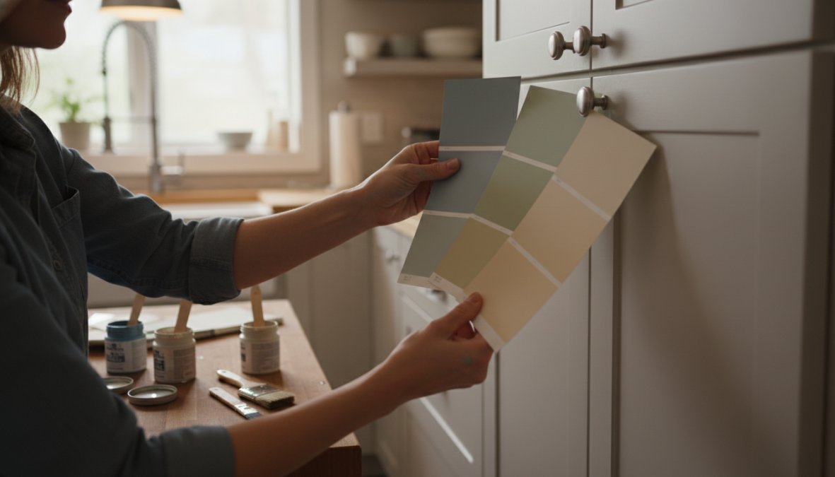
Testing cabinet paint colors correctly requires more than taping a chip to the door. Here’s the process that actually works:
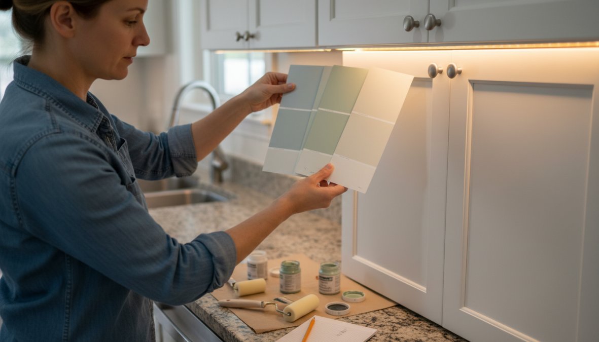
- Narrow to three colors. Based on your style, undertone analysis, and lighting assessment, select no more than three candidates. More than three creates decision paralysis.
- Purchase sample sizes. Most paint brands offer 4-8 oz sample containers. Buy one for each color.
- Apply two coats to a large piece of primed poster board or foam core. Do not paint directly on the cabinet for testing. This lets you move the sample around the room.
- Test at 12 inches x 12 inches minimum. Small swatches lie. Color looks different at scale.
- Observe under all lighting conditions. Morning light, afternoon light, evening with overhead lights on, and with under-cabinet lighting if you have it.
- Hold the sample against your countertop, backsplash, and flooring. Check for undertone conflicts.
- Live with it for 48 hours. Colors shift as the paint fully dries and as your eye adjusts.
- Check the sample at eye level on a vertical surface. Paint reads differently horizontal (on a chip card) versus vertical (on a cabinet door).
The Psychology of Color in High-Traffic Kitchen Zones
Most cabinet color guides treat psychology as a footnote. It shouldn’t be. The kitchen is the highest-traffic room in most homes, surfaces get touched hundreds of times a day, spills happen, grease accumulates, and the space is used under every emotional condition from rushed weekday mornings to relaxed weekend cooking. The color you choose affects how the room feels to use, how quickly it shows wear, and how much mental energy it takes to maintain. These are not abstract concerns.
How Specific Colors Affect Mood and Behavior in the Kitchen
Color psychology research consistently identifies a few mechanisms that apply directly to kitchen environments:
Warm whites and creams (yellow or red undertones): These colors activate a sense of warmth and approachability. In kitchens that function as social hubs, where people gather while cooking, where kids do homework at the island, warm whites lower the psychological barrier to entering and lingering in the space. Benjamin Moore’s White Dove and Sherwin-Williams’ Alabaster both sit in this category. The trade-off: warm undertones can make a small, poorly lit kitchen feel slightly yellowed over time, particularly under incandescent lighting.
Cool whites and blue-grays (blue or green undertones): These colors read as clean, organized, and professional. They’re the dominant choice in kitchens where the primary function is focused cooking rather than socializing. Sherwin-Williams’ Repose Gray and Benjamin Moore’s Chantilly Lace both carry cool undertones that reinforce a sense of order. The psychological effect is real: a cooler, cleaner palette can make a cluttered kitchen feel more manageable. The trade-off: in north-facing kitchens with limited natural light, cool tones can tip from calm into cold.
Sage and muted greens: Green sits at the intersection of warm and cool on the color wheel, which is part of why it has become one of the most popular cabinet colors in recent years. Muted greens, think Farrow & Ball’s Mizzle or Sherwin-Williams’ Privilege Green, are psychologically associated with rest and restoration. In a kitchen where cooking is a form of decompression rather than a chore, these colors support that function. They also have a practical advantage: mid-value greens hide minor surface scuffs and grease smudges better than whites or very light neutrals.
Deep navy and charcoal: Saturated dark colors create a sense of intimacy and deliberateness. They signal that the kitchen is a designed space, not just a functional one. The psychological effect is confidence and enclosure, which works well in large, open kitchens that otherwise feel impersonal, and poorly in small kitchens where enclosure becomes oppression. Dark cabinets also have a significant practical advantage in high-traffic family kitchens: they conceal fingerprints, minor dings, and the general patina of daily use far better than any white or light neutral.
The Wear-and-Tear Color Strategy Most Guides Skip
Beyond mood, color choice has a direct impact on how much maintenance a kitchen requires, and how long it looks good between repaints. This is the practical psychology of color in high-traffic zones, and it’s almost never discussed.
Light-value cabinets (whites, creams, light grays): Show every fingerprint, grease smudge, and scuff mark. In a household with children or heavy daily cooking, light cabinets require more frequent cleaning and will show wear at door edges and around hardware within a few years. This doesn’t mean avoid them, it means pair them with a semi-gloss or gloss finish that wipes clean easily, and accept that touch-up painting will be part of the maintenance cycle.
Mid-value cabinets (sage greens, warm taupes, medium grays): The sweet spot for high-traffic kitchens. These colors are light enough to keep the room feeling open but dark enough to absorb minor surface variation without it reading as dirt or damage. If you have young children or cook daily, a mid-value color in a satin or semi-gloss finish is the most forgiving long-term choice.
Dark-value cabinets (navy, forest green, charcoal, black): Hide fingerprints and scuffs effectively but show dust, water spots, and cleaning streaks more than lighter colors. In practice, dark cabinets require a different cleaning routine, microfiber cloths and streak-free cleaners rather than paper towels, but less frequent cleaning overall in a busy household.
If your kitchen sees heavy daily use and you want a light cabinet color, choose a color that sits at least one value step above pure white, something like a warm cream or a soft greige rather than a bright white. The slight depth in the color absorbs minor surface variation and extends the time between touch-ups significantly.
Matching Color Psychology to How You Actually Use the Kitchen
The most useful question to ask before choosing a cabinet color is not "what color do I like?" but "what do I want to feel when I walk into this kitchen?"
- Social kitchen (gathering, entertaining, family hub): Warm whites, creams, warm greiges, or soft sage greens. These colors invite people in and make the space feel lived-in rather than precious.
- Focused cooking kitchen (serious cooking, minimal socializing): Cool whites, blue-grays, or deep navy. These colors support concentration and create a sense of professional calm.
- Small kitchen that needs to feel larger: Light values in warm or neutral tones, not necessarily white, but nothing below a mid-value. Light reflects off the surface and expands perceived space.
- Large kitchen that feels impersonal: Mid-to-dark values on lower cabinets, or a two-tone approach with darker lowers and lighter uppers. The darker value grounds the space and makes it feel more intimate.
- High-traffic family kitchen with young children: Mid-value colors in satin or semi-gloss. Prioritize forgiveness over perfection.
The color you choose will be in your kitchen for years. Aligning it with how the room actually functions, not just how it looks in a photograph, is what separates a cabinet color you love in year five from one you’re tired of in year two.
Common Mistakes to Avoid When Choosing Cabinet Paint Colors
Most cabinet color regrets trace back to the same handful of errors. Knowing them in advance saves significant time and money.
Choosing color from a chip card alone. Color chips are printed representations, not paint samples. The actual paint on your specific cabinets, under your specific lighting, will look different. Always test with real paint on a real surface.
Ignoring the undertone of your existing finishes. If your granite has strong pink undertones and you choose a cool gray cabinet color, the pink in the stone will become more pronounced and the gray will look off. Undertone alignment is not optional.
Skipping proper surface preparation. The best paint color applied over a poorly prepared surface will look amateur. Cleaning, degreasing, sanding, and priming are what separate a professional result from a DIY one. Denver Cabinet Painting Colorado’s emphasis on meticulous preparation before any application is exactly why their finishes look consistent and hold up over time.
Choosing a finish that’s too flat. Matte cabinet finishes look beautiful in design magazines and are impractical in real kitchens. Satin or semi-gloss is the right choice for surfaces that see daily contact and cleaning.
Not accounting for the color of adjacent rooms. If your kitchen is open to a living or dining area, the cabinet color needs to work with those spaces too. A color that looks perfect in isolation can create a jarring transition in an open floor plan.
Painting without testing at scale. A color that looks right on a 2-inch chip can look completely different across 40 linear feet of cabinet doors. Always test at scale before committing.
If you’re torn between two colors, paint a full cabinet door (or a large piece of foam core cut to door size) in each and swap them in and out over several days. The one you keep gravitating toward is the right choice.
Choosing the right cabinet paint color is a technical decision as much as an aesthetic one, and getting it wrong is expensive to fix. Denver Cabinet Painting Colorado brings 40 years of experience in cabinet painting, refinishing, and glazing to every project across the Denver metro area, with a focus on meticulous surface preparation and smooth, consistent finishes that hold up to daily kitchen use. If you’re ready to transform your kitchen without the cost of full cabinet replacement, get a free quote from Denver Cabinet Painting Colorado and take the guesswork out of the process.
Frequently Asked Questions
What is the most popular cabinet paint color right now?
White and off-white tones remain consistently popular for kitchen cabinets because they brighten spaces, coordinate easily with most countertops and backsplashes, and support both modern and traditional design styles. However, navy blue, sage green, and warm greige tones have gained significant traction as homeowners look to add personality and depth to their kitchens. The best choice ultimately depends on your kitchen's lighting, size, and overall aesthetic.
How do I choose a cabinet paint color that matches my countertops?
When matching cabinet colors with countertops, start by identifying the dominant undertone in your countertop, warm (beige, gold, red) or cool (gray, blue, green). Choose a cabinet color that shares or intentionally contrasts that undertone. For example, white cabinets with cool gray undertones pair well with light quartz countertops. Always test paint swatches directly against your countertop surface in the actual kitchen lighting before making a final decision.
What paint finish is best for kitchen cabinets?
For kitchen cabinets, a satin or semi-gloss finish is generally recommended. Satin offers a subtle sheen that resists moisture and is easy to wipe clean, making it ideal for most kitchens. Semi-gloss provides even greater durability and stain resistance, which is especially valuable in high-traffic areas. Urethane trim enamel is a professional-grade option that delivers exceptional hardness and a smooth, consistent finish. Matte finishes are not recommended for cabinets as they absorb grease and are difficult to clean.
How do I test paint samples on cabinets before painting the whole kitchen?
To test paint samples on cabinets effectively, purchase sample pots of your top two or three colors and apply them to a large piece of cardboard or directly onto an inconspicuous cabinet door. Apply at least two coats and observe the swatches at different times of day, morning, afternoon, and evening, under both natural light and your kitchen's artificial lighting. Live with the samples for two to three days before deciding, as colors can shift noticeably depending on light conditions.
Should kitchen cabinets be lighter or darker than the walls?
There is no single rule, but a common approach is to keep cabinets lighter than walls to make the kitchen feel open and airy, especially in smaller spaces. In larger kitchens, darker cabinets can add drama and anchor the room. Two-tone designs, lighter upper cabinets with darker lower cabinets, are a popular middle ground. The key is ensuring the cabinet color, wall color, and countertop work together as a cohesive color palette rather than competing with one another.
Do I need to prime cabinets before painting them?
Yes, priming cabinets before painting is strongly recommended and is a critical part of proper preparation. A quality primer helps the topcoat bond securely to the cabinet surface, improves color accuracy, and increases the overall durability of the finish. Skipping primer is one of the most common mistakes in cabinet refinishing and often leads to peeling or uneven coverage. For the smoothest, longest-lasting results, professional cabinet painters treat thorough preparation, including sanding, cleaning, and priming, as the top priority.
This article was written using GrandRanker